Brand guidelines.
Everything you need to use the RaceLineApp.ai logo correctly: the lockups, clear space, colour palette and typefaces. For coverage and partner use, please keep the logo as supplied.
The mark
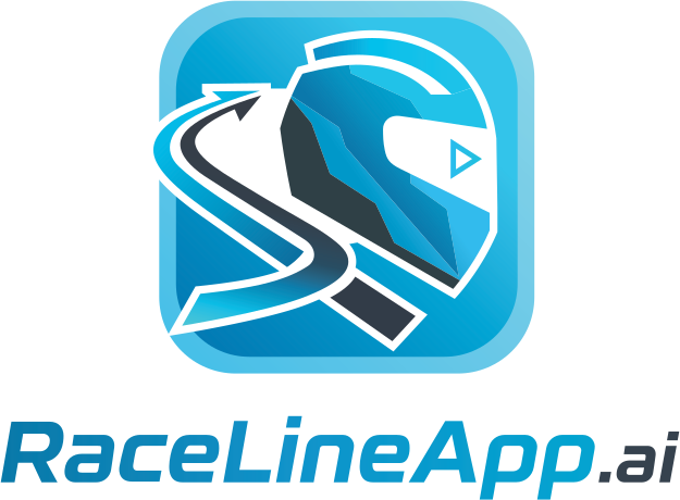
A crash helmet integrated with a racing-line motif in a rounded-square tile, locked to the RaceLineApp.ai logotype. The stacked lockup is primary; the horizontal lockup is for wide spaces. Use the standard colourway on light backgrounds and the dark colourway on dark.


Using the logo
- Use the files as supplied. Don't recolour, stretch, rotate, outline or add effects.
- Keep the dark colourway for dark backgrounds and the standard colourway for light.
- Give the logo room - see the clear space below.
Give it room
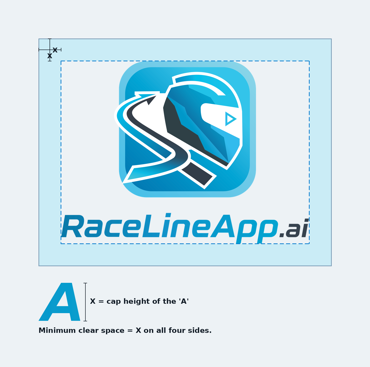
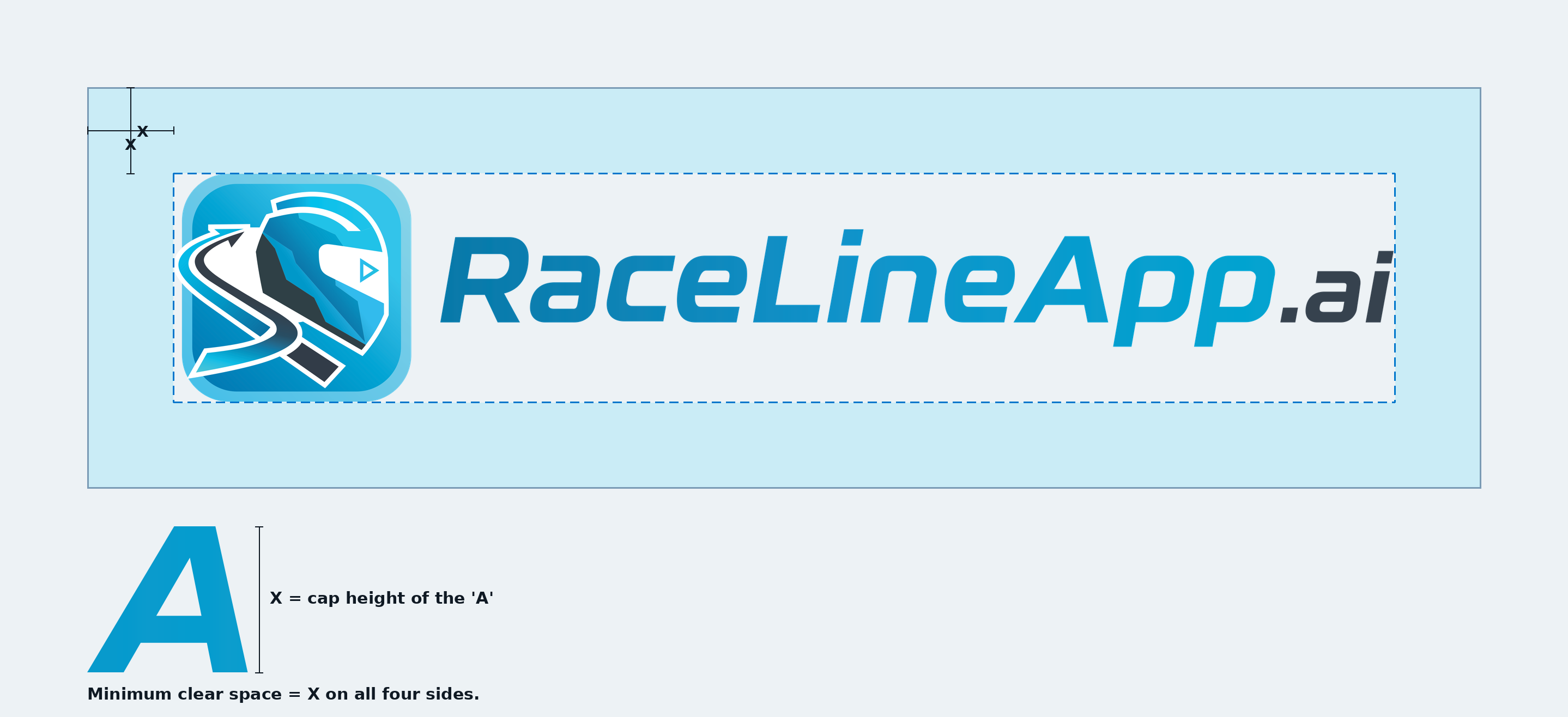
Keep a minimum exclusion zone around the logo equal to X on all four sides, where X is the cap height of the capital "A" in the logotype. Keep type, imagery, edges and other logos out of this zone.
Minimum size: don't reproduce the full lockup below 25 mm wide in print or 140 px on screen. The app icon holds down to 10 mm / 24 px.
Palette
The full palette in screen (HEX / RGB) and print (CMYK) values. Brake Red, Warning Amber and Power Green are the coaching cue states - Brake, Turn and Power - and are never used decoratively.
CMYK is a standard conversion. For large-format print, confirm against a printed proof.
Typefaces
Headlines are set in Barlow Condensed, uppercase and tracked. Body copy is Barlow. Both are free from Google Fonts.
CARRY SPEED.
Rajdhani and Share Tech Mono are used only for the in-app instrument readouts, not in marketing.
Get the files
The brand pack holds every lockup and colourway as transparent PNGs, solid-panel PNGs and scalable vector files, plus the clear-space diagrams and these values.
Master artwork and other file formats are available on request. For this or any brand or media question, email hello@racelineapp.ai.